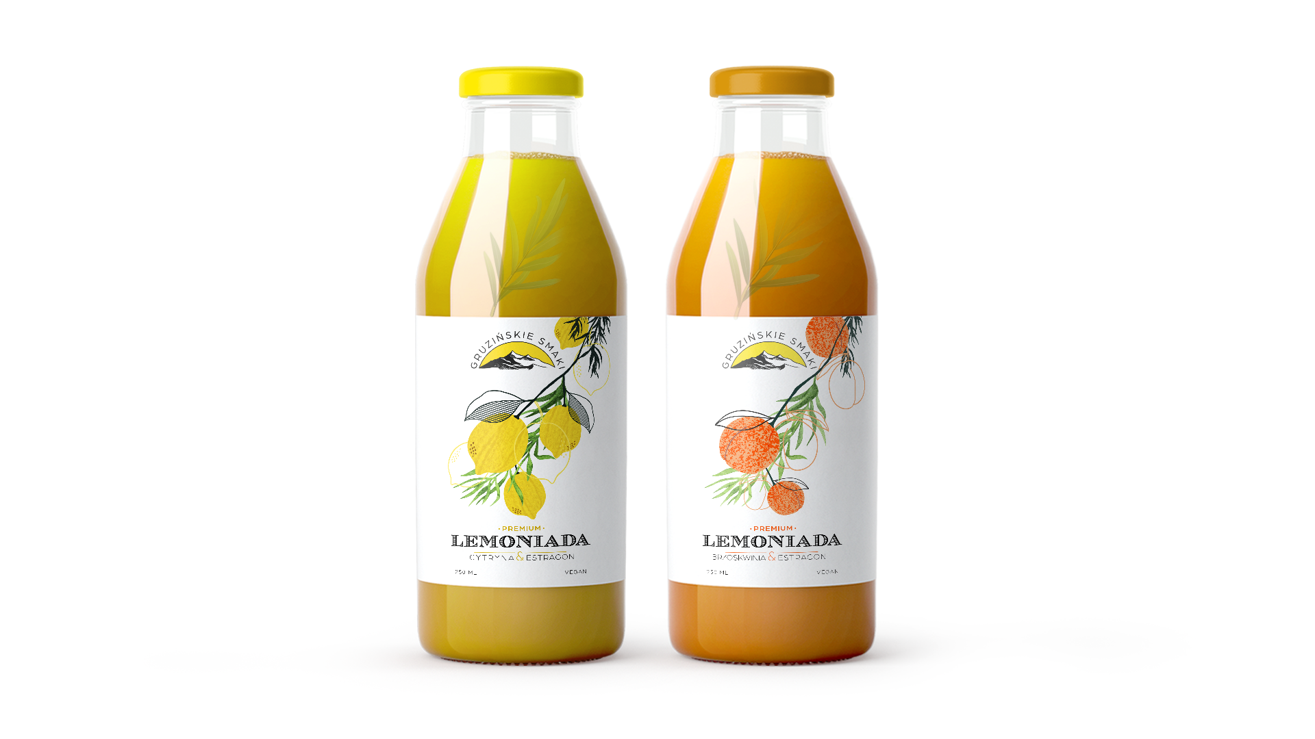
Stworzenie koncepcji etykiety dla gruzińskiej lemoniady z rozmarynem pod marką "Gruzińskie Smaki" stanowiło fascynujące wyzwanie projektowe. Głównym celem było podkreślenie autentyczności i tradycyjnego charakteru produktu, zachowując jednocześnie subtelną elegancję i nowoczesny wizerunek.
Klient wyraźnie wyraził preferencję dla kraftowego, delikatnego podejścia, które w pełni oddałoby naturalność lemoniady. Produkt jest dostępny w dwóch smakach, z głównym akcentem na rozmaryn, który nadaje napojowi charakterystyczny aromat i smak. W odpowiedzi na te wymagania, skoncentrowałem się na prostym układzie typografii, który nie tylko klarownie prezentuje markę "Gruzińskie Smaki", ale również podkreśla wysoką jakość i autentyczność produktu.
Aby wzbogacić projekt, zdecydowałem się na płaskie tło etykiety, które dodatkowo podkreśla ręczną pracę i naturalny charakter lemoniady. Kolorystyka projektu została dobrane stonowane, aby harmonizować z naturalnymi tonami lemoniady z rozmarynem, co nadaje całej kompozycji subtelny i elegancki wygląd.
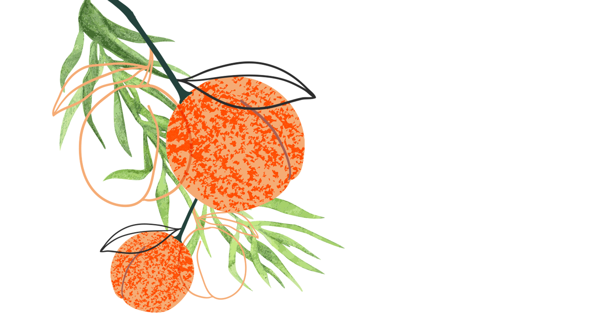
Dodatkowe grafiki, nawiązujące do gruzińskiej kultury i krajobrazu, zostały umieszczone na etykiecie, aby wzbogacić design o lokalny charakter i unikalność. Projektowanie dla "Gruzińskich Smaków" było dla mnie inspirującym procesem, który pozwolił połączyć tradycję z nowoczesnością, przynosząc efekt estetyczny, który przyciągnie uwagę klientów i podkreśli wyjątkowość lemoniady z rozmarynem.
---
Creating the label concept for Georgian lemonade with rosemary under the brand "Georgian Flavors" was a fascinating design challenge. The main goal was to emphasize the authenticity and traditional character of the product while maintaining subtle elegance and a modern image.
The client expressed a clear preference for a crafty, delicate approach that would fully convey the naturalness of the lemonade. The product is available in two flavors, with a strong emphasis on rosemary, which gives the beverage its distinctive aroma and flavor. In response to these requirements, I focused on a simple typography layout that not only clearly presents the "Georgian Flavors" brand but also highlights the high quality and authenticity of the product.
To enrich the design, I opted for a flat background for the label, which further emphasizes the handmade nature and natural character of the lemonade. The color scheme was chosen to be subdued, harmonizing with the natural tones of the rosemary lemonade, giving the entire composition a subtle and elegant look.
Additional graphics inspired by Georgian culture and landscapes were incorporated into the label to enrich the design with local character and uniqueness. Designing for "Georgian Flavors" was an inspiring process for me, allowing me to blend tradition with modernity and achieve an aesthetic result that will attract customers' attention and highlight the uniqueness of the rosemary lemonade.